# Carousel
A pure HTML and vanilla JS implementation of Zag JS Carousel
An accessible carousel component that leverages native CSS Scroll Snap for smooth, performant scrolling between slides.
# Anatomy
The Carousel component consists of the following data parts:
root, control, prev-trigger, next-trigger, autoplay-trigger item-group, item, indicator-group, indicator
<div class="carousel carousel-js">
<div data-part="root">
<div data-part="item-group">
<div data-part="item">
<img src="/images/bg/beach.jpg" alt="beach" />
</div>
<div data-part="item">
<img src="/images/bg/winter.jpg" alt="winter" />
</div>
<div data-part="item">
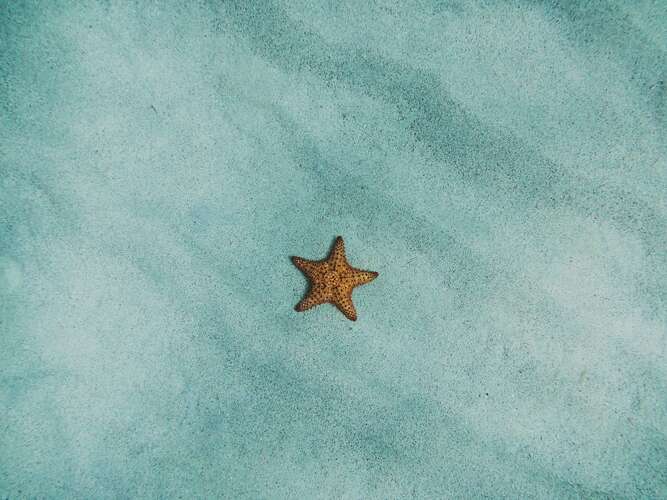
<img src="/images/bg/star.jpg" alt="star" />
</div>
<div data-part="item">
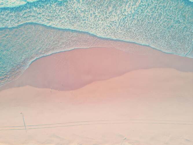
<img src="/images/bg/sand.jpg" alt="sand" />
</div>
<div data-part="item">
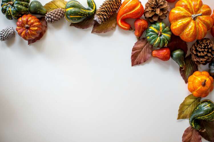
<img src="/images/bg/fall.jpg" alt="fall" />
</div>
</div>
<div data-part="control">
<button data-part="prev-trigger" aria-label="Previous Slide">
<svg
xmlns="http://www.w3.org/2000/svg"
fill="none"
viewBox="0 0 24 24"
stroke-width="1.5"
stroke="currentColor"
class="icon"
>
<path
stroke-linecap="round"
stroke-linejoin="round"
d="M15.75 19.5 8.25 12l7.5-7.5"
/>
</svg>
</button>
<div data-part="indicator-group"></div>
<button data-part="next-trigger" aria-label="Next Slide">
<svg
xmlns="http://www.w3.org/2000/svg"
fill="none"
viewBox="0 0 24 24"
stroke-width="1.5"
stroke="currentColor"
class="icon"
>
<path
stroke-linecap="round"
stroke-linejoin="round"
d="m8.25 4.5 7.5 7.5-7.5 7.5"
/>
</svg>
</button>
</div>
</div>
</div>
# Data attributes
Each carousel can be set with different settings with the following data-attribute.


<div
              class="carousel carousel-js"
              data-orientation="horizontal"
              data-loop="true"
              data-allow-mouse-drag="true"
              data-slides-per-page="2"
              data-padding="var(--spacing-ui)"
              data-spacing="var(--spacing-ui-gap)"
              data-autoplay="false"
            >
              <div data-part="root" class="max-w-full">
                <div data-part="item-group">
                  <div data-part="item">
                    <img src="/images/bg/beach.jpg" alt="beach" />
                  </div>
                  <div data-part="item">
                    <img src="/images/bg/winter.jpg" alt="winter" />
                  </div>
                  <div data-part="item">
                    <img src="/images/bg/star.jpg" alt="star" />
                  </div>
                  <div data-part="item">
                    <img src="/images/bg/sand.jpg" alt="sand" />
                  </div>
                  <div data-part="item">
                    <img src="/images/bg/fall.jpg" alt="fall" />
                  </div>
                </div>
                <div data-part="control">
                  <button data-part="prev-trigger" aria-label="Previous Slide">
                    <svg
                      xmlns="http://www.w3.org/2000/svg"
                      fill="none"
                      viewBox="0 0 24 24"
                      stroke-width="1.5"
                      stroke="currentColor"
                      class="icon"
                    >
                      <path
                        stroke-linecap="round"
                        stroke-linejoin="round"
                        d="M15.75 19.5 8.25 12l7.5-7.5"
                      />
                    </svg>
                  </button>
                  <div data-part="indicator-group"></div>
                  <button data-part="next-trigger" aria-label="Next Slide">
                    <svg
                      xmlns="http://www.w3.org/2000/svg"
                      fill="none"
                      viewBox="0 0 24 24"
                      stroke-width="1.5"
                      stroke="currentColor"
                      class="icon"
                    >
                      <path
                        stroke-linecap="round"
                        stroke-linejoin="round"
                        d="m8.25 4.5 7.5 7.5-7.5 7.5"
                      />
                    </svg>
                  </button>
                </div>
              </div>
            </div>
id
Type: string
Description: Unique id of the carousel. Default generated if none is provided..
data-slides-per-page
Type: number
Description: The number of slides to show at a time.
data-loop
Type: boolean
Description: Whether the carousel should loop around.
data-orientation
Type: string
Description: The orientation of the carousel. Can be horizontal or vertical - horizontal: only left and right arrow key navigation will work. - vertical: only up and down arrow key navigation will work.
data-allow-mouse-drag
Type: boolean
Description: Whether to allow scrolling via dragging with mouse. Default: true
data-autoplay
Type: boolean
Description: Whether to scroll automatically. The default delay is 4000ms.
data-delay
Type: number
Description: The delay for autoplay. The default delay is 4000ms.
data-loop
Type: boolean
Description: Whether the carousel should loop around.
data-default-page
Type: number
Description: The initial page to scroll to when rendered. Use when you don't need to control the page of the carousel.
data-padding
Type: string
Description: Defines the extra space added around the scrollable area, enabling nearby items to remain partially in view.
data-page
Type: number
Description: The controlled page of the carousel.
data-slides-per-move
Type: number || string
Description: The number of slides to scroll at a time. When set to auto, the number of slides to scroll is determined by the slidesPerPage property. Default: "auto"
data-snap-type
Type: string ||
Description: The snap type of the item. "proximity" | "mandatory". Default: "mandatory"
data-spacing
Type: string
Description: The amount of space between items. Default: "0px"
data-in-view-threshold
Type: number
Description: The threshold for determining if an item is in view. Default: "0.6"
# Event Callbacks
Each carousel component can receive callbacks that can be used to respond to user interaction with custom behavior.
You must add a custom id for the carousel and a event listener for your event name
document
              .getElementById("my-carousel")
              ?.addEventListener("my-carousel-event", (event) => {
                console.log("Received event:", (event as CustomEvent).detail);
              });
<div
              id="my-carousel"
              class="carousel carousel-js"
              data-on-page-change="my-carousel-event"
            >
              <div data-part="root">
                <div data-part="item-group">
                  <div data-part="item">
                    <img src="/images/bg/beach.jpg" alt="beach" />
                  </div>
                  <div data-part="item">
                    <img src="/images/bg/winter.jpg" alt="winter" />
                  </div>
                  <div data-part="item">
                    <img src="/images/bg/star.jpg" alt="star" />
                  </div>
                  <div data-part="item">
                    <img src="/images/bg/sand.jpg" alt="sand" />
                  </div>
                  <div data-part="item">
                    <img src="/images/bg/fall.jpg" alt="fall" />
                  </div>
                </div>
                <div data-part="control">
                  <button data-part="prev-trigger" aria-label="Previous Slide">
                    <svg
                      xmlns="http://www.w3.org/2000/svg"
                      fill="none"
                      viewBox="0 0 24 24"
                      stroke-width="1.5"
                      stroke="currentColor"
                      class="icon"
                    >
                      <path
                        stroke-linecap="round"
                        stroke-linejoin="round"
                        d="M15.75 19.5 8.25 12l7.5-7.5"
                      />
                    </svg>
                  </button>
                  <div data-part="indicator-group"></div>
                  <button data-part="next-trigger" aria-label="Next Slide">
                    <svg
                      xmlns="http://www.w3.org/2000/svg"
                      fill="none"
                      viewBox="0 0 24 24"
                      stroke-width="1.5"
                      stroke="currentColor"
                      class="icon"
                    >
                      <path
                        stroke-linecap="round"
                        stroke-linejoin="round"
                        d="m8.25 4.5 7.5 7.5-7.5 7.5"
                      />
                    </svg>
                  </button>
                </div>
              </div>
            </div>
Open your browser's console to see the events received when the carousel page changes
data-on-page-change
Type: string
Description: Event name to be send when the page changes.
data-on-drag-status-change
Type: string
Description: Event name to be send when the drag status changes.
data-on-autoplay-status-change
Type: string
Description: Event name to be send when the autoplay status changes.
# Orientation
By default, the carousel is displayed on a horizontal layout.
You can also switch it to a vertical layout.
When using changing layout, keyboard navigation changes accordingly:
- Vertical: use ↑ / ↓ to move between items
- Horizontal: use ← / → to move between items
<div class="carousel carousel-js" data-orientation="vertical">
              <div data-part="root">
                <div data-part="item-group">
                  <div data-part="item">
                    <img src="/images/bg/beach.jpg" alt="beach" />
                  </div>
                  <div data-part="item">
                    <img src="/images/bg/winter.jpg" alt="winter" />
                  </div>
                  <div data-part="item">
                    <img src="/images/bg/star.jpg" alt="star" />
                  </div>
                  <div data-part="item">
                    <img src="/images/bg/sand.jpg" alt="sand" />
                  </div>
                  <div data-part="item">
                    <img src="/images/bg/fall.jpg" alt="fall" />
                  </div>
                </div>
                <div data-part="control">
                  <button data-part="prev-trigger" aria-label="Previous Slide">
                    <svg
                      xmlns="http://www.w3.org/2000/svg"
                      fill="none"
                      viewBox="0 0 24 24"
                      stroke-width="1.5"
                      stroke="currentColor"
                      class="icon"
                    >
                      <path
                        stroke-linecap="round"
                        stroke-linejoin="round"
                        d="M15.75 19.5 8.25 12l7.5-7.5"
                      />
                    </svg>
                  </button>
                  <div data-part="indicator-group"></div>
                  <button data-part="next-trigger" aria-label="Next Slide">
                    <svg
                      xmlns="http://www.w3.org/2000/svg"
                      fill="none"
                      viewBox="0 0 24 24"
                      stroke-width="1.5"
                      stroke="currentColor"
                      class="icon"
                    >
                      <path
                        stroke-linecap="round"
                        stroke-linejoin="round"
                        d="m8.25 4.5 7.5 7.5-7.5 7.5"
                      />
                    </svg>
                  </button>
                </div>
              </div>
            </div>
# Autoplay
You can add a play and pause button along with the data-autoplay and data-delay options.
<div class="carousel carousel-js" data-autoplay="true" data-delay="1000">
              <div data-part="root">
                <div data-part="item-group">
                  <div data-part="item">
                    <img src="/images/bg/beach.jpg" alt="beach" />
                  </div>
                  <div data-part="item">
                    <img src="/images/bg/winter.jpg" alt="winter" />
                  </div>
                  <div data-part="item">
                    <img src="/images/bg/star.jpg" alt="star" />
                  </div>
                  <div data-part="item">
                    <img src="/images/bg/sand.jpg" alt="sand" />
                  </div>
                  <div data-part="item">
                    <img src="/images/bg/fall.jpg" alt="fall" />
                  </div>
                </div>
                <div data-part="control">
                  <button data-part="prev-trigger" aria-label="Previous Slide">
                    <svg
                      xmlns="http://www.w3.org/2000/svg"
                      fill="none"
                      viewBox="0 0 24 24"
                      stroke-width="1.5"
                      stroke="currentColor"
                      class="icon"
                    >
                      <path
                        stroke-linecap="round"
                        stroke-linejoin="round"
                        d="M15.75 19.5 8.25 12l7.5-7.5"
                      />
                    </svg>
                  </button>
                  <div data-part="indicator-group"></div>
                  <button data-part="next-trigger" aria-label="Next Slide">
                    <svg
                      xmlns="http://www.w3.org/2000/svg"
                      fill="none"
                      viewBox="0 0 24 24"
                      stroke-width="1.5"
                      stroke="currentColor"
                      class="icon"
                    >
                      <path
                        stroke-linecap="round"
                        stroke-linejoin="round"
                        d="m8.25 4.5 7.5 7.5-7.5 7.5"
                      />
                    </svg>
                  </button>
                  <button data-part="autoplay-trigger" aria-label="Autoplay">
                    <svg
                      data-play
                      xmlns="http://www.w3.org/2000/svg"
                      fill="none"
                      viewBox="0 0 24 24"
                      stroke-width="1.5"
                      stroke="currentColor"
                      class="icon"
                    >
                      <path
                        stroke-linecap="round"
                        stroke-linejoin="round"
                        d="M5.25 5.653c0-.856.917-1.398 1.667-.986l11.54 6.347a1.125 1.125 0 0 1 0 1.972l-11.54 6.347a1.125 1.125 0 0 1-1.667-.986V5.653Z"
                      />
                    </svg>
                    <svg
                      data-pause
                      xmlns="http://www.w3.org/2000/svg"
                      fill="none"
                      viewBox="0 0 24 24"
                      stroke-width="1.5"
                      stroke="currentColor"
                      class="icon"
                    >
                      <path
                        stroke-linecap="round"
                        stroke-linejoin="round"
                        d="M15.75 5.25v13.5m-7.5-13.5v13.5"
                      />
                    </svg>
                  </button>
                </div>
              </div>
            </div>
# Modifiers
Carousel support modifier classes that control their appearance.
You can combine multiple modifiers on the same carousel.
The default modifier is applied automatically, so you don’t need to include it explicitly.
| Modifier | Description |
|---|---|
| Color | Sets the color theme of the carousel. |
| Size | Adjusts the overall size of the carousel. |
You may have noticed the double dash before the modifier name — this follows the BEM (Block Element Modifier) naming convention
# Color
Use class="carousel--{color}" to set the color of an carousel.
Available options:
accent(default), brand, alert, info, success
<div class="carousel carousel-js carousel--brand">
              <div data-part="root">
                <div data-part="item-group">
                  <div data-part="item">
                    <img src="/images/bg/beach.jpg" alt="beach" />
                  </div>
                  <div data-part="item">
                    <img src="/images/bg/winter.jpg" alt="winter" />
                  </div>
                  <div data-part="item">
                    <img src="/images/bg/star.jpg" alt="star" />
                  </div>
                  <div data-part="item">
                    <img src="/images/bg/sand.jpg" alt="sand" />
                  </div>
                  <div data-part="item">
                    <img src="/images/bg/fall.jpg" alt="fall" />
                  </div>
                </div>
                <div data-part="control">
                  <button data-part="prev-trigger" aria-label="Previous Slide">
                    <svg
                      xmlns="http://www.w3.org/2000/svg"
                      fill="none"
                      viewBox="0 0 24 24"
                      stroke-width="1.5"
                      stroke="currentColor"
                      class="icon"
                    >
                      <path
                        stroke-linecap="round"
                        stroke-linejoin="round"
                        d="M15.75 19.5 8.25 12l7.5-7.5"
                      />
                    </svg>
                  </button>
                  <div data-part="indicator-group"></div>
                  <button data-part="next-trigger" aria-label="Next Slide">
                    <svg
                      xmlns="http://www.w3.org/2000/svg"
                      fill="none"
                      viewBox="0 0 24 24"
                      stroke-width="1.5"
                      stroke="currentColor"
                      class="icon"
                    >
                      <path
                        stroke-linecap="round"
                        stroke-linejoin="round"
                        d="m8.25 4.5 7.5 7.5-7.5 7.5"
                      />
                    </svg>
                  </button>
                </div>
              </div>
            </div>
            <div class="carousel carousel-js carousel--alert">
              <div data-part="root">
                <div data-part="item-group">
                  <div data-part="item">
                    <img src="/images/bg/beach.jpg" alt="beach" />
                  </div>
                  <div data-part="item">
                    <img src="/images/bg/winter.jpg" alt="winter" />
                  </div>
                  <div data-part="item">
                    <img src="/images/bg/star.jpg" alt="star" />
                  </div>
                  <div data-part="item">
                    <img src="/images/bg/sand.jpg" alt="sand" />
                  </div>
                  <div data-part="item">
                    <img src="/images/bg/fall.jpg" alt="fall" />
                  </div>
                </div>
                <div data-part="control">
                  <button data-part="prev-trigger" aria-label="Previous Slide">
                    <svg
                      xmlns="http://www.w3.org/2000/svg"
                      fill="none"
                      viewBox="0 0 24 24"
                      stroke-width="1.5"
                      stroke="currentColor"
                      class="icon"
                    >
                      <path
                        stroke-linecap="round"
                        stroke-linejoin="round"
                        d="M15.75 19.5 8.25 12l7.5-7.5"
                      />
                    </svg>
                  </button>
                  <div data-part="indicator-group"></div>
                  <button data-part="next-trigger" aria-label="Next Slide">
                    <svg
                      xmlns="http://www.w3.org/2000/svg"
                      fill="none"
                      viewBox="0 0 24 24"
                      stroke-width="1.5"
                      stroke="currentColor"
                      class="icon"
                    >
                      <path
                        stroke-linecap="round"
                        stroke-linejoin="round"
                        d="m8.25 4.5 7.5 7.5-7.5 7.5"
                      />
                    </svg>
                  </button>
                </div>
              </div>
            </div>
            <div class="carousel carousel-js carousel--info">
              <div data-part="root">
                <div data-part="item-group">
                  <div data-part="item">
                    <img src="/images/bg/beach.jpg" alt="beach" />
                  </div>
                  <div data-part="item">
                    <img src="/images/bg/winter.jpg" alt="winter" />
                  </div>
                  <div data-part="item">
                    <img src="/images/bg/star.jpg" alt="star" />
                  </div>
                  <div data-part="item">
                    <img src="/images/bg/sand.jpg" alt="sand" />
                  </div>
                  <div data-part="item">
                    <img src="/images/bg/fall.jpg" alt="fall" />
                  </div>
                </div>
                <div data-part="control">
                  <button data-part="prev-trigger" aria-label="Previous Slide">
                    <svg
                      xmlns="http://www.w3.org/2000/svg"
                      fill="none"
                      viewBox="0 0 24 24"
                      stroke-width="1.5"
                      stroke="currentColor"
                      class="icon"
                    >
                      <path
                        stroke-linecap="round"
                        stroke-linejoin="round"
                        d="M15.75 19.5 8.25 12l7.5-7.5"
                      />
                    </svg>
                  </button>
                  <div data-part="indicator-group"></div>
                  <button data-part="next-trigger" aria-label="Next Slide">
                    <svg
                      xmlns="http://www.w3.org/2000/svg"
                      fill="none"
                      viewBox="0 0 24 24"
                      stroke-width="1.5"
                      stroke="currentColor"
                      class="icon"
                    >
                      <path
                        stroke-linecap="round"
                        stroke-linejoin="round"
                        d="m8.25 4.5 7.5 7.5-7.5 7.5"
                      />
                    </svg>
                  </button>
                </div>
              </div>
            </div>
            <div class="carousel carousel-js carousel--success">
              <div data-part="root">
                <div data-part="item-group">
                  <div data-part="item">
                    <img src="/images/bg/beach.jpg" alt="beach" />
                  </div>
                  <div data-part="item">
                    <img src="/images/bg/winter.jpg" alt="winter" />
                  </div>
                  <div data-part="item">
                    <img src="/images/bg/star.jpg" alt="star" />
                  </div>
                  <div data-part="item">
                    <img src="/images/bg/sand.jpg" alt="sand" />
                  </div>
                  <div data-part="item">
                    <img src="/images/bg/fall.jpg" alt="fall" />
                  </div>
                </div>
                <div data-part="control">
                  <button data-part="prev-trigger" aria-label="Previous Slide">
                    <svg
                      xmlns="http://www.w3.org/2000/svg"
                      fill="none"
                      viewBox="0 0 24 24"
                      stroke-width="1.5"
                      stroke="currentColor"
                      class="icon"
                    >
                      <path
                        stroke-linecap="round"
                        stroke-linejoin="round"
                        d="M15.75 19.5 8.25 12l7.5-7.5"
                      />
                    </svg>
                  </button>
                  <div data-part="indicator-group"></div>
                  <button data-part="next-trigger" aria-label="Next Slide">
                    <svg
                      xmlns="http://www.w3.org/2000/svg"
                      fill="none"
                      viewBox="0 0 24 24"
                      stroke-width="1.5"
                      stroke="currentColor"
                      class="icon"
                    >
                      <path
                        stroke-linecap="round"
                        stroke-linejoin="round"
                        d="m8.25 4.5 7.5 7.5-7.5 7.5"
                      />
                    </svg>
                  </button>
                </div>
              </div>
            </div>
# Size
Use class="carousel--{size}" to set the size of a carousel.
Available options:
sm, md (default), lg, xl
<div class="carousel carousel-js carousel--sm">
              <div data-part="root">
                <div data-part="item-group">
                  <div data-part="item">
                    <img src="/images/bg/beach.jpg" alt="beach" />
                  </div>
                  <div data-part="item">
                    <img src="/images/bg/winter.jpg" alt="winter" />
                  </div>
                  <div data-part="item">
                    <img src="/images/bg/star.jpg" alt="star" />
                  </div>
                  <div data-part="item">
                    <img src="/images/bg/sand.jpg" alt="sand" />
                  </div>
                  <div data-part="item">
                    <img src="/images/bg/fall.jpg" alt="fall" />
                  </div>
                </div>
                <div data-part="control">
                  <button data-part="prev-trigger" aria-label="Previous Slide">
                    <svg
                      xmlns="http://www.w3.org/2000/svg"
                      fill="none"
                      viewBox="0 0 24 24"
                      stroke-width="1.5"
                      stroke="currentColor"
                      class="icon"
                    >
                      <path
                        stroke-linecap="round"
                        stroke-linejoin="round"
                        d="M15.75 19.5 8.25 12l7.5-7.5"
                      />
                    </svg>
                  </button>
                  <div data-part="indicator-group"></div>
                  <button data-part="next-trigger" aria-label="Next Slide">
                    <svg
                      xmlns="http://www.w3.org/2000/svg"
                      fill="none"
                      viewBox="0 0 24 24"
                      stroke-width="1.5"
                      stroke="currentColor"
                      class="icon"
                    >
                      <path
                        stroke-linecap="round"
                        stroke-linejoin="round"
                        d="m8.25 4.5 7.5 7.5-7.5 7.5"
                      />
                    </svg>
                  </button>
                </div>
              </div>
            </div>
            <div class="carousel carousel-js">
              <div data-part="root">
                <div data-part="item-group">
                  <div data-part="item">
                    <img src="/images/bg/beach.jpg" alt="beach" />
                  </div>
                  <div data-part="item">
                    <img src="/images/bg/winter.jpg" alt="winter" />
                  </div>
                  <div data-part="item">
                    <img src="/images/bg/star.jpg" alt="star" />
                  </div>
                  <div data-part="item">
                    <img src="/images/bg/sand.jpg" alt="sand" />
                  </div>
                  <div data-part="item">
                    <img src="/images/bg/fall.jpg" alt="fall" />
                  </div>
                </div>
                <div data-part="control">
                  <button data-part="prev-trigger" aria-label="Previous Slide">
                    <svg
                      xmlns="http://www.w3.org/2000/svg"
                      fill="none"
                      viewBox="0 0 24 24"
                      stroke-width="1.5"
                      stroke="currentColor"
                      class="icon"
                    >
                      <path
                        stroke-linecap="round"
                        stroke-linejoin="round"
                        d="M15.75 19.5 8.25 12l7.5-7.5"
                      />
                    </svg>
                  </button>
                  <div data-part="indicator-group"></div>
                  <button data-part="next-trigger" aria-label="Next Slide">
                    <svg
                      xmlns="http://www.w3.org/2000/svg"
                      fill="none"
                      viewBox="0 0 24 24"
                      stroke-width="1.5"
                      stroke="currentColor"
                      class="icon"
                    >
                      <path
                        stroke-linecap="round"
                        stroke-linejoin="round"
                        d="m8.25 4.5 7.5 7.5-7.5 7.5"
                      />
                    </svg>
                  </button>
                </div>
              </div>
            </div>
            <div class="carousel carousel-js carousel--lg">
              <div data-part="root">
                <div data-part="item-group">
                  <div data-part="item">
                    <img src="/images/bg/beach.jpg" alt="beach" />
                  </div>
                  <div data-part="item">
                    <img src="/images/bg/winter.jpg" alt="winter" />
                  </div>
                  <div data-part="item">
                    <img src="/images/bg/star.jpg" alt="star" />
                  </div>
                  <div data-part="item">
                    <img src="/images/bg/sand.jpg" alt="sand" />
                  </div>
                  <div data-part="item">
                    <img src="/images/bg/fall.jpg" alt="fall" />
                  </div>
                </div>
                <div data-part="control">
                  <button data-part="prev-trigger" aria-label="Previous Slide">
                    <svg
                      xmlns="http://www.w3.org/2000/svg"
                      fill="none"
                      viewBox="0 0 24 24"
                      stroke-width="1.5"
                      stroke="currentColor"
                      class="icon"
                    >
                      <path
                        stroke-linecap="round"
                        stroke-linejoin="round"
                        d="M15.75 19.5 8.25 12l7.5-7.5"
                      />
                    </svg>
                  </button>
                  <div data-part="indicator-group"></div>
                  <button data-part="next-trigger" aria-label="Next Slide">
                    <svg
                      xmlns="http://www.w3.org/2000/svg"
                      fill="none"
                      viewBox="0 0 24 24"
                      stroke-width="1.5"
                      stroke="currentColor"
                      class="icon"
                    >
                      <path
                        stroke-linecap="round"
                        stroke-linejoin="round"
                        d="m8.25 4.5 7.5 7.5-7.5 7.5"
                      />
                    </svg>
                  </button>
                </div>
              </div>
            </div>
            <div class="carousel carousel-js carousel--xl">
              <div data-part="root">
                <div data-part="item-group">
                  <div data-part="item">
                    <img src="/images/bg/beach.jpg" alt="beach" />
                  </div>
                  <div data-part="item">
                    <img src="/images/bg/winter.jpg" alt="winter" />
                  </div>
                  <div data-part="item">
                    <img src="/images/bg/star.jpg" alt="star" />
                  </div>
                  <div data-part="item">
                    <img src="/images/bg/sand.jpg" alt="sand" />
                  </div>
                  <div data-part="item">
                    <img src="/images/bg/fall.jpg" alt="fall" />
                  </div>
                </div>
                <div data-part="control">
                  <button data-part="prev-trigger" aria-label="Previous Slide">
                    <svg
                      xmlns="http://www.w3.org/2000/svg"
                      fill="none"
                      viewBox="0 0 24 24"
                      stroke-width="1.5"
                      stroke="currentColor"
                      class="icon"
                    >
                      <path
                        stroke-linecap="round"
                        stroke-linejoin="round"
                        d="M15.75 19.5 8.25 12l7.5-7.5"
                      />
                    </svg>
                  </button>
                  <div data-part="indicator-group"></div>
                  <button data-part="next-trigger" aria-label="Next Slide">
                    <svg
                      xmlns="http://www.w3.org/2000/svg"
                      fill="none"
                      viewBox="0 0 24 24"
                      stroke-width="1.5"
                      stroke="currentColor"
                      class="icon"
                    >
                      <path
                        stroke-linecap="round"
                        stroke-linejoin="round"
                        d="m8.25 4.5 7.5 7.5-7.5 7.5"
                      />
                    </svg>
                  </button>
                </div>
              </div>
            </div>
# Installation
First, complete the Corex UI initial installation guide for your platform, bundler, or framework.
- Import and initialize the component
import { initCarousel } from "@corex-ui/static";
            initCarousel();
This will initialize all elements with class="carousel-js" and add the necessary interaction behavior.
- Add styling
The component is unstyled by default for maximum customization flexibility.
To apply the default Corex UI design system styles, import the stylesheet:
@import "@corex-ui/design/components/carousel.css";
These styles will be applied to all elements with the carousel class.